
Centralizing Workplace Analytics
Problem
Fragmented data systems creating inefficient decision-making workflows across multiple stakeholder types.
Goal
Design unified analytics experiences that transform raw workplace data into actionable insights for strategic decision-making.
Role
Lead designer owning analytics platform design, supervising external design/dev resources.
Background
LinkedIn’s Workplace team manages internal office operations and space planning across the company. The team relied on multiple disconnected data sources and tools, with stakeholders often exporting data to Excel for their own analysis. I was brought in as the lead designer on the Data and Analytics team to create a centralized platform that would transform how professionals—from operations leaders to space planners—access and interpret workplace data.
The Challenge: When Data Becomes a Barrier
The existing data landscape presented several interconnected problems that were hindering effective decision-making:
- Data Fragmentation. Users relied on disparate sources and tools to access and analyze data, leading to a disjointed experience across different teams and use cases.
- Data Literacy Gaps. Many stakeholders lacked clarity on what data was available and struggled with accessing it efficiently, often resorting to manual workarounds.
- Misaligned Insights. Users frequently drew conclusions that didn’t align with the actual data due to interpretation difficulties, leading to conflicting analyses when shared across teams.
- Decentralized Analysis. Teams downloaded data and performed individual analyses in Excel, contributing to data discrepancies and inconsistent interpretations across the organization.
My Process: Research-Driven Design Strategy
Discovery: Understanding the Data Ecosystem
I began by embedding myself in the stakeholder workflow, conducting surveys among similar user personas to identify overarching pain points, then following up with individual interviews to understand specific workflows and obstacles.
My approach was methodical: Rather than assuming I understood the data needs, I shadowed users across different roles—executives, space planners, operations leaders—to map their actual decision points and identify where data gaps were causing friction.
Key insight: I discovered that the same data needed to tell different stories depending on the user’s role. An operations leader needed high-level trends with drill-down capability, while a space planner required granular floor-level utilization patterns.
Information Architecture: Designing for Multiple Mental Models
Challenge 1: Multi-Persona Platform Design
Through interviews, I learned that different user types approached the same data with completely different questions:
- Operations leaders: “Are we over or under-utilizing our spaces overall?”
- Space planners: “Which specific areas need reallocation or renovation?”
- Executives: “How do our space efficiency metrics compare to benchmarks?”
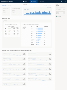
I created a scalable information architecture that organized data meaningfully across diverse user needs. The dashboard featured tailored views and interactions for each persona, ensuring that each user saw the metrics most relevant to their decision-making process within a unified, intuitive experience.
Challenge 2: Data Storytelling and Visualization
After learning that raw KPI terminology like “Unique Visitors” left users confused and unable to connect data to actionable insights, I introduced the following:
- Conversational Interface Design: I replaced jargon-heavy KPIs with natural-language questions. For example, instead of “Unique Visitors,” I used “How many people visited the site at least once?”
- Insight-First Visualization: I designed dashboards to surface insights first, then provide supporting detail. Rather than overwhelming users with data dumps, I focused on answering specific business questions.
- Color Psychology Application: I strategically applied color theory to highlight patterns, trends, and data anomalies, guiding users’ attention to the most critical information.
- Data Integrity Design: I introduced missing data and error states to maintain transparency about data quality and limitations.
Standardization: Creating Organizational Impact
- Systems Thinking: I established consistent design patterns that could scale across LinkedIn’s internal reporting needs.
- Style Guide Development: I created visualization templates and a comprehensive style guide that was adopted organization-wide, ensuring consistency across all internal data reporting.
- Team Education: I taught the data team UX principles for effective storytelling in Power BI, enabling them to apply user-centered design thinking to their own report creation.
- Educational Integration: I integrated educational overlays and tooltips directly into dashboards to improve data literacy across the organization.
Enablers
Design System Foundation
I studied LinkedIn’s company-wide design system and selected components needed for internal reporting, creating an internal design library that serves as the go-to resource for developers implementing reports. This collaborative approach ensures consistency and is still used today across all internal workplace reporting globally.
Technical Implementation
Drawing from my front-end development background, I collaborated directly with a data analyst to code JSON templates for our reporting theme. We iteratively tested and refined the code, which became the standard template used to this day for all internal workplace reporting globally.
User Trust and Feedback Systems
I introduced a data glossary embedded within each report, allowing users to click and see definitions of metrics and how they’re calculated—increasing data integrity and user trust. Additionally, I implemented a “feedback” button that enabled analysts to email me directly with suggestions for better data analysis, which significantly helped with report iterations and brought data closer to user needs.
Key Solutions: From Fragmentation to Clarity
Workplace Insights Dashboard (Web Application)
I designed a centralized analytics platform that provided stakeholders with a “single pane of glass” for all workplace data, featuring:
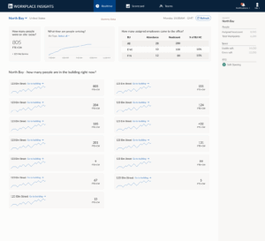
- Data Centralization: Consolidated persistent data from multiple systems on a single screen—for example, contextual site information like assigned headcount (metadata that doesn’t change frequently) displayed alongside dynamic dashboards showing real-time building occupancy.
- Interactive Filtering: Thoughtfully distributed toggle filters throughout reports for relevant charts. For example, executives could toggle between full-time employees and contractors at the individual chart level to focus on specific workforce segments.
- Dual Chart Integration: Combined multiple visualizations to address user follow-up questions and convey complete data narratives. For instance, showing average utilization by site alongside headcount and recent growth trends, giving users all the data needed to answer questions like “How many people are expected to come versus how many actually attended?”
- Streamlined Navigation: Enabled seamless drill-down from site to building to floor-level data. For example, a site with 10 buildings allowed users to view all buildings together, then drill into specific under or over-utilized ones to analyze trends and understand underlying reasons.

Data Visualization Standards (Power BI)
I established the standard for LinkedIn’s internal data reporting through a comprehensive approach that combined design, implementation, and user support systems to create a scalable solution still used across the organization today.


Impact: Transforming Data into Decisions
Organizational Results
- Increased Adoption: Comprehensive reports saw significantly higher usage rates as stakeholders could finally access the insights they needed
- Reduced Custom Requests: Teams aligned around shared, trusted insights, dramatically reducing the need for one-off custom analytics
- Faster Decision-Making: Stakeholders could make data-informed decisions with greater confidence and speed
Process Transformation
- From Exports to Insights: Eliminated the Excel export workflow that was causing data inconsistencies
- Standardized Reporting: Design standards became the foundation for all internal reporting across Workplace
- Enhanced Data Literacy: Educational components improved organization-wide understanding of data interpretation
Key Learnings: Decision-First Design
- Question-Driven Design. The breakthrough came when I shifted from asking “What data do we have?” to “What decision does this person need to make?” This reframe helped me move from surfacing all available data to designing decision-first information architecture.
- Strategic Curation. Working across personas taught me the power of eliminating noise and prioritizing the right metrics for the right user. The goal wasn’t comprehensive data access—it was delivering insights in a language users could immediately act on.
- Systems Impact. By tying together dashboards and Power BI reports into a shared design system, I helped transform workplace analytics from a passive data repository into an active platform for confident, strategic decision-making.