Enhancing User Experience for Occupancy Analytics (Rzero)
Add TOC
Overview
As the lead designer for an energy-saving platform, I was tasked with redesigning the user-facing occupancy analytics dashboard. The goal was to transform an outdated and compromised user experience into a modern, intuitive tool that empowers customers to understand how their spaces are being used. This involved addressing critical usability issues and aligning the interface with contemporary design standards, all while minimizing development effort. The insights from this occupancy data are crucial for optimizing energy consumption, although the dashboard itself focused on the occupancy aspect.
My Role
I was the sole designer on this project, responsible for all aspects of the UX redesign. This involved:
- Conducting user research to identify pain points.
- Developing information architecture and interaction flows.
- Creating wireframes and high-fidelity mockups.
- Presenting designs to product managers and engineering teams.
- Providing ongoing design support during implementation, including answering developer questions and proposing design alternatives when needed.”
Challenges
I inherited a design with significant usability issues that hindered users’ ability to effectively analyze occupancy data. Key challenges included:
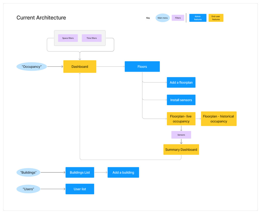
- Conflicting User Personas: The application was presenting features to two distinct user personas with different goals, which resulted in confusion for both.
- Difficult-to-interpret visualizations: Floorplan views, both real-time and historical, suffered from excessive color use, poor contrast, and cluttered legends, making it hard for users to quickly grasp occupancy patterns.
- Inefficient filtering: The tag filter, which allowed users to filter data by sensor attributes, was poorly structured, requiring users to navigate a complex, multi-column layout with unclear interaction patterns.
- Lack of Design System: The existing product lacked a cohesive design system, leading to visual inconsistencies and increased design debt.”
My Process
To address these challenges, I followed a user-centered design process:
- Conducting user research to identify pain points.
- Developing information architecture and interaction flows.
- Creating wireframes and high-fidelity mockups.
- Presenting designs to product managers and engineering teams.
- Providing ongoing design support during implementation, including answering developer questions and proposing design alternatives when needed.
User Research
I joined routine weekly calls with customer success representatives to gather firsthand user feedback. When usability issues were raised, for example, a user might say, “I don’t use this feature because I don’t understand it,” I would investigate further to understand the underlying need and how the redesigned feature could provide value.
For example, regarding the 90-day conference room utilization floorplan, my questions included: “If this floorplan could show you which spaces are used more and less in the past 90 days, would that information be valuable?” and “What actions would you take based on this information?”
I also validated my assumptions about the challenges of the application with users. For example, I confirmed that the admin user and the end-user goals and workflows were distinct; admins focused on configuration, while end-users needed to quickly understand and act on the data.
Redesigning the User Experience: Information Architecture and Interaction Design
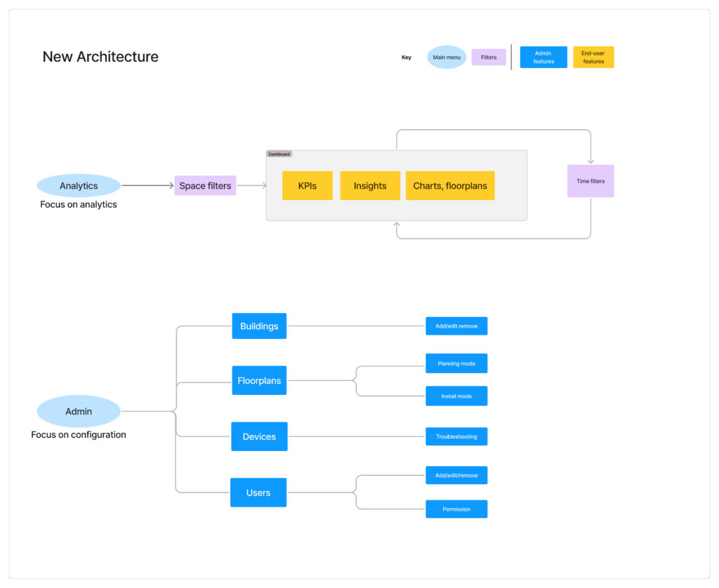
#1 Designing for Distinct User Needs: Separating the End-User and Admin Experiences
Initial user research revealed a fundamental problem: the existing platform attempted to serve two distinct user personas within a single application.
- End-users (e.g., workplace managers): Primarily focused on consuming analytics to make decisions about space utilization.
- Admin users (e.g., facilities managers): Primarily focused on configuring sensors, tagging them with space types, and preparing the data for analysis.
This conflation of roles led to a confusing and inefficient experience for both groups.
I led the effort to separate these personas by designing a separate Admin Portal. This involved:
- Defining the information architecture for the Admin Portal, focusing on the specific needs and workflows of admin users.
For example, an admin user saw a floorplan with icons reflecting sensor type, while the end-user saw the occupancy status regardless of sensor type. - Designing the user interface for the Admin Portal, ensuring a clear and intuitive experience for tasks such as sensor management, data input, and system configuration.
Impact: This separation streamlined workflows, reduced complexity, and improved the overall usability of the platform for both end-users and admin users. Separating the admin portal also allowed engineering to move quicker on the implementation because we were able to keep the design minimal, focusing on utility.
Information Architecture Diagram
#2
Enhancing Occupancy Visualization: Floorplan Redesign
The existing floorplan visualizations were cluttered and difficult to use. My process focused on:
- Feature Prioritization:Through user feedback, I identified the most essential data points and removed extraneous information, streamlining the display to focus on what users needed most (e.g., real-time occupancy status, key performance indicators).
- Visual Hierarchy and UI Cleanup: I addressed issues of excessive color use and poor contrast, creating a cleaner, more intuitive visual hierarchy. This involved:To improve clarity and enable users to quickly identify insights and trends, I simplified the legend. For the real-time floorplan, this simplification was crucial for providing immediate insights into occupancy status (e.g., seat availability). For the historical data floorplan, I reduced the number of gradient color shades by half, from ten to five, expanding each color’s interval from 10% to 20%. This change enhanced readability while preserving the visibility of actual occupancy numbers.
- Implementing a more consistent and restrained color palette, ensuring that colors represented meaning in the data and were not used for purely decorative purposes.
- Improving contrast between text and background elements for better legibility. To ensure sufficient contrast and clarity—especially on busy floorplans with potentially dark outlines—I also refined the hover and select states for interactive elements using a combination of a bolder color effect and shadows. These enhancements help users to easily discern selected areas from the surrounding floorplan, even when it contains complex visual information.
- Interaction Design: I enhanced the interactivity of the floorplan to allow users to:
- Hover over and select specific sensors for detailed analytics.
- Filter specific space types (e.g., conference rooms, open workstations) on the map.
Examples
Real-time Floor Plan Transformation
- BEFORE: Original design by previous team
- AFTER: My redesign solution:

Sensor Heatmap Floor Plan Transformation
BEFORE: Original design by previous team
AFTER: My redesign solution:

#3 Improving Data Filtering: The Tag Filter Overhaul
The original tag filter presented a complex, excessively multi-column layout that was difficult for users to navigate and understand. My redesign involved restructuring the filter into a two-level hierarchy, with primary tag categories in the first column and sub-tags in a second, contextually dependent column, to reflect the logical relationships between tags and make the filter more navigable.
I also implemented clear interaction patterns to guide user behavior, using checkboxes for multi-select filtering, radio buttons for single-select filtering, where appropriate, and a reset button to help with user errors. The redesign also resulted in a smaller, more compact dropdown menu.
The following shows the UI before (design by previous team) and after (my redesign solution):


Key Enablers: Design System and Collaboration
Design System Adoption
Given the time constraints, I proactively adopted a lean design system approach. I selected key components from an existing design system on Figma, which was also used by our front-end developers as their front-end kit. This ensured visual consistency across the redesigned analytics dashboard and facilitated smoother collaboration and alignment with the development team, laying the groundwork for a more comprehensive design system implementation in the future.
Collaboration
Throughout the project, I worked closely with two product managers to align the design with business goals and technical constraints, while ensuring dev effort is low. During implementation, I presented the initial designs to an engineering team of approximately eight developers but also met with them regularly throughout the implementation phase, delivering alternative designs as needed in a timely manner, and collaborating on alternative solutions to address feasibility issues and minimize development effort.”
Conclusion
Impact
The redesign significantly improved the user experience, as demonstrated by the following:
- Positive initial feedback: Customers expressed high satisfaction during product demos. I was acknowledged with a formal, special company-wide Kudo.
- Increased feature utilization: Previously underutilized features became essential tools. For instance, the improved real-time floorplan view, which allows users to identify available seats in real-time, led to: Customers requesting its integration into office kiosks as a replacement for traditional wayfinding solutions.
- Improved data accessibility: The UI’s clean and clear design enabled users to easily incorporate charts into their presentations. Specifically, customers mentioned that the improved clarity allowed them to easily incorporate charts into their own presentations, because external users could understand the story the data tells without the context of other adjacent charts.
- These improvements led to a measurable increase in customer engagement, with weekly visits increasing by 40%, which in turn led to a significant expansion in sensor purchases as customers sought to capture more data in their spaces.
- Sales representatives also reported a more positive perception of the product during sales demos, indicating that the improved user experience and data presentation resonated well with potential customers.
Learnings and Reflections
This project reinforced the importance of continuous user feedback and the power of iterative design. The routine weekly meetings with customers enabled me to get quick feedback and iterate rapidly.
Given the product team’s high priority on minimizing engineering effort, I learned to first present the ideal design solution, regardless of perceived implementation complexity. Initially, I proposed simpler solutions. However, when I presented the ideal solution, the development team and I were able to collaborate and find an efficient way to implement it. As a result, I also learned to trust the collaboration process with my fellow engineers—to find a way together to tackle the best solution and make it low effort.
A WordPress Commenter
Hi, this is a comment.
To get started with moderating, editing, and deleting comments, please visit the Comments screen in the dashboard.
Commenter avatars come from Gravatar.